2.8 Reuse and valorization of data
Section outline
-
-
1. Reuse and enhancement of data in the data lifecycle
This is the final step in the data life cycle but also the starting point of a new cycle if the data are reused for a new research project.
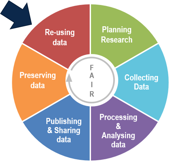
Adaptation of Research data lifecycle – UK Data Service
It is important to prepare the data for sharing in order to make it FAIR. This way other researchers can use them for new research projects.
-
2. Reuse and citation of data
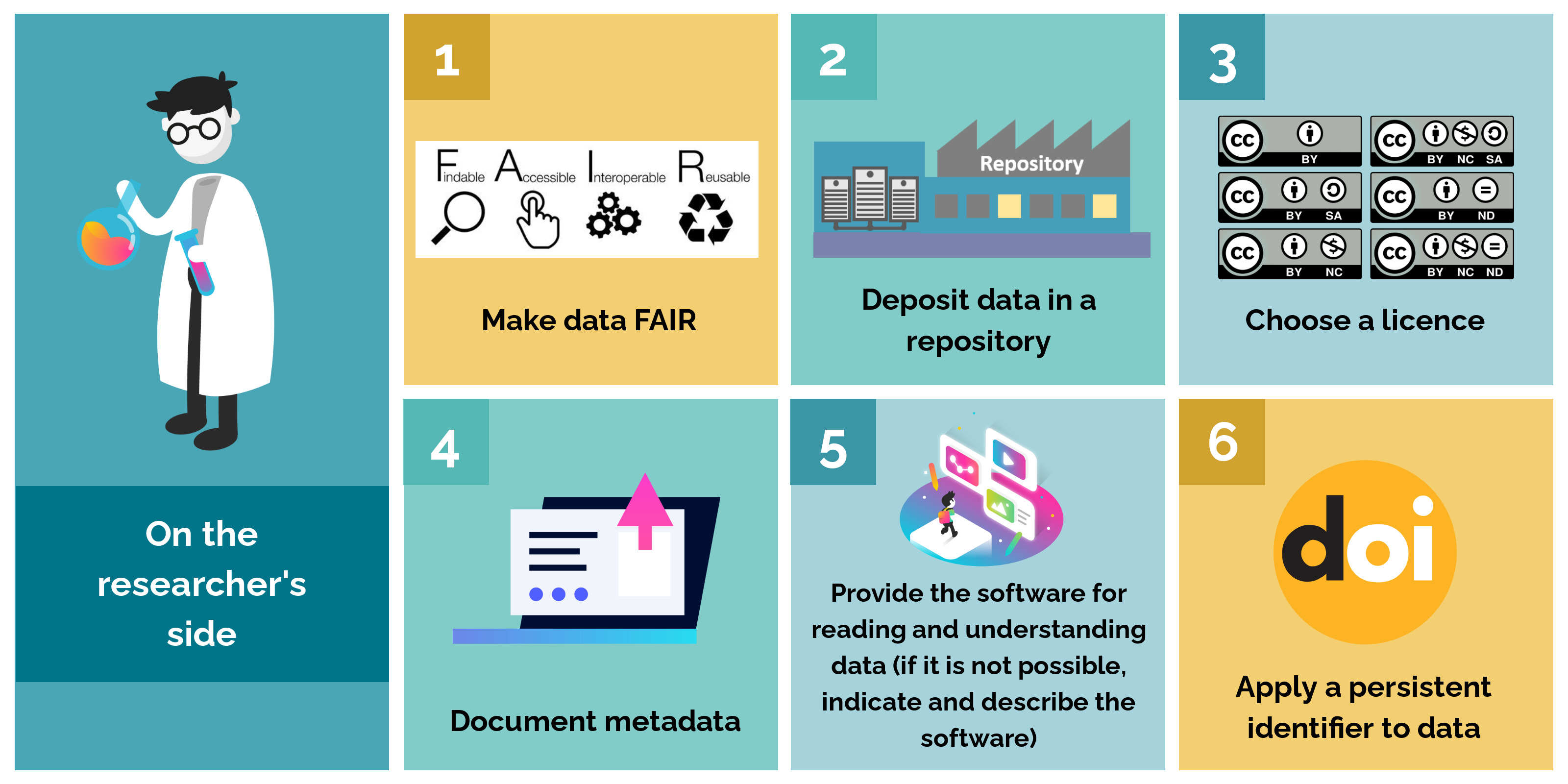
On the researcher's side
In order to ensure that the research data they have generated can be reused under good conditions, researcher must adopt several good practices:
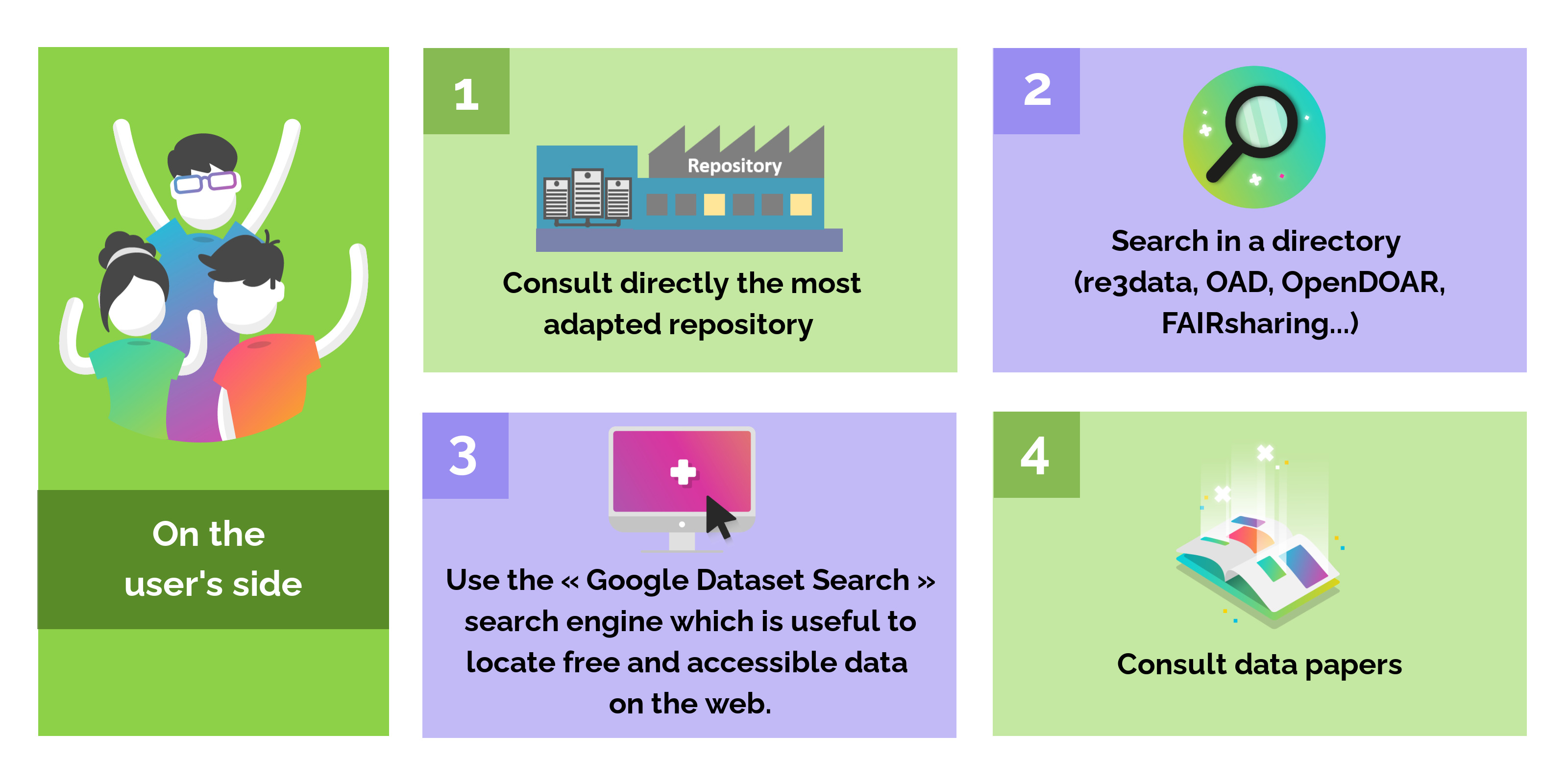
On the user’s side
There are several ways for a researcher to find reusable datasets:
Links :
In all cases, re-users must respect certain rules:
- Respect the intellectual property of the authors as mentioned in the licence
- Cite the data if the license requires it (it is recommended to always cite its sources)
- Link data to publications.
Tip: there are tools to help you cite a dataset correctly, such as:
- The "Cite all versions" part proposed by the Zenodo repository
- The DOI Citation Formatter service which allows you to simply and automatically obtain a complete citation from a DOI.
To complete, see the summary sheet on data citation proposed by DataOne:
Source : https://dataoneorg.github.io/Education//lessons/08_citation/L08_DataCitation_Handout.pdf -
3. Data papers and data journals
Writing and publishing a data paper is a good way for researchers to add value to their research data.
A data paper is a publication that describes research datasets and associated metadata. It follows the same editorial process as traditional scientific articles:
- Elements common to classic articles (title, abstract, keywords…)
- Specific data elements (data types, formats, production processes and methods, metadata, reuse…)
A data paper can be published in a data journal (journal dedicated to this type of publication) or in a classic journal that accepts data papers.
Access to data from the data paper can be done in two ways:
- the data are integrated in the article and published as supplementary data
- the data are deposited in a repository and this is the persistent identifier (example: the DOI) that links data paper with data.
An example of data papers in the domain of environment
Two data papers were written on photographic data to study the evolution of vegetation phenology in different ecosystems across North America. The data are derived from automated digital images (taken every 30 minutes), collected via the PhenoCam network. The data are time series characterizing the color of the vegetation, including the degree of greening. The PhenoCam Explorer interface has been developed to facilitate data exploration and visualization, from which the user can also download data on a site-by-site basis. The images are also available in real time through the PhenoCam project web page.
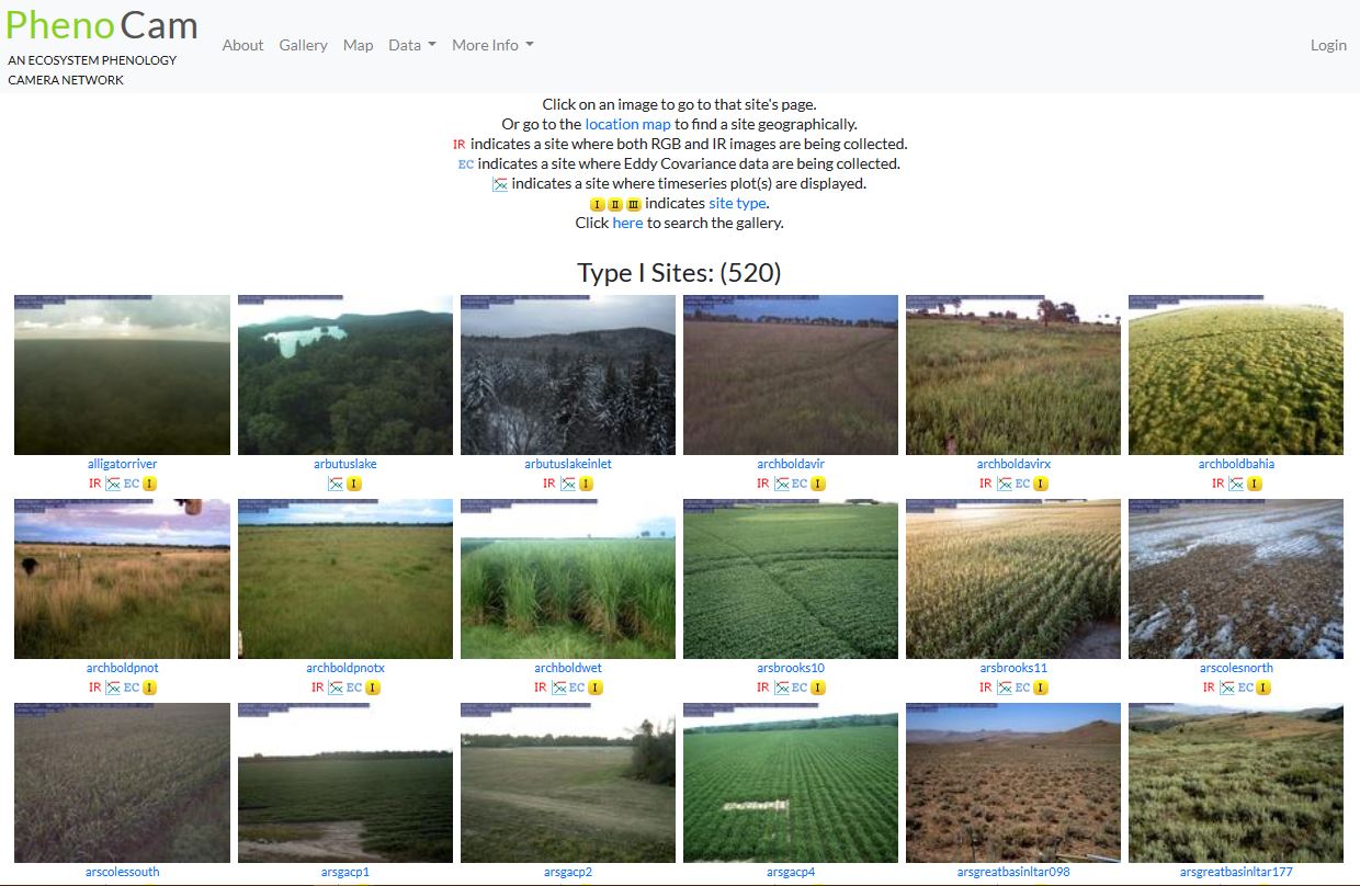
- Tracking vegetation phenology across diverse North American biomes using PhenoCam imagery: This data paper published in 2018 presents version 1.0 of a series of datasets, all assembled, constituting about 750 years of observations (more than 15 million images produced by about 400 automated digital cameras). The data were deposited in NASA's ORNL DAAC repository.
- Tracking vegetation phenology across diverse biomes using Version 2.0 of the PhenoCam Dataset: This data paper published in 2019 presents version 2.0 of a series of datasets of 1783 site-years and 393 digital cameras located in different ecosystems in a wide range of plant functional types, biomes, and climates. The quality of the datasets has been improved. The data were deposited in NASA's ORNL DAAC repository.
-
4. Data exposure and visualization
In addition to depositing data in a repository, and perhaps publishing a data paper, exposing the data is another good way to add value.
Indeed, expose data in visual form (maps, graphs, etc.) via a platform is indicated especially in the case of large and complex data.
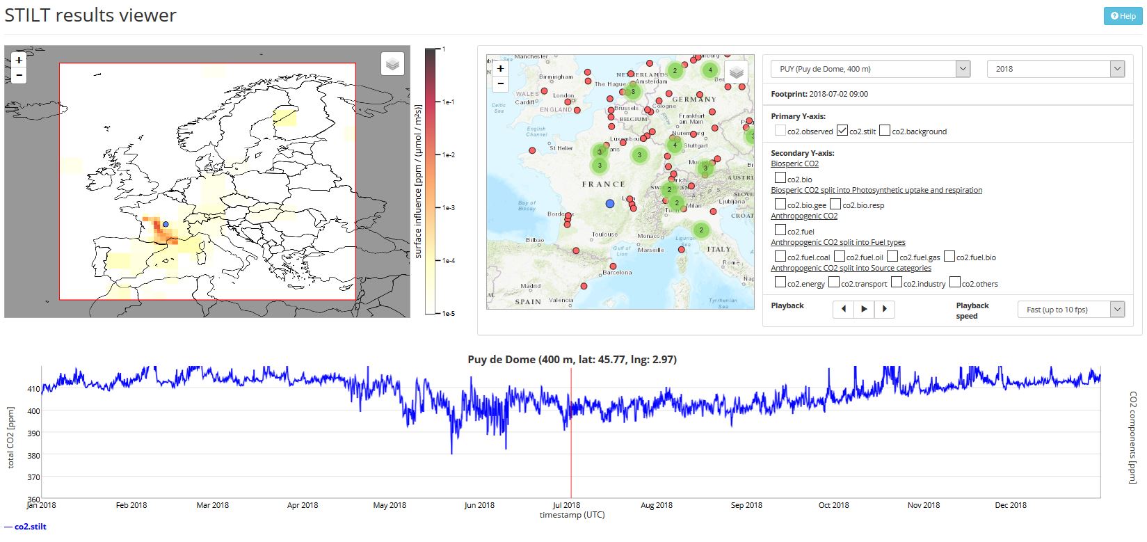
Example 1
These data (available on the ICOS Carbon Portal) comes from time series of values on hundreds of parameters. With visualization tools, we can see the evolution of CO2 concentrations over a year, coupled with the origin of the air mass. This would be very difficult to understand without data visualization.
Example 2
CoReA: a digital library has been created with the Omeka tool for the archaeological documentation of the CNRS French Centre Camille Julian. It allows to navigate easily through archaeological corpus and resources.
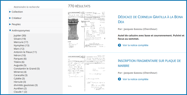
Omeka is an open-source web publishing platform for sharing digital collections and creating media-rich online exhibits.
From raw research data, the tool allows the creation of editorialized collections (structured, accessible, and visible on the web). The tool offers a great modularity of functionalities thanks to numerous plugins, and handles various multimedia objects (texts, images, sounds, videos).
The tool offers several technical advantages:
- the interface is simple and intuitive;
- the metadata can be harvested, allowing in particular the referencing in other databases;
- an Omeka collection can be connected to other services thanks to a REST API.
Example 3
See the example of data visualization from the "Republic of Letters", where researchers map thousands of letters exchanged in the 18th century and can learn very rapidly what it once took a lifetime of study to comprehend (Seen in the Lesson 1 Unit 2: Data and Science): https://www.youtube.com/watch?v=nw0oS-AOIPE.
-